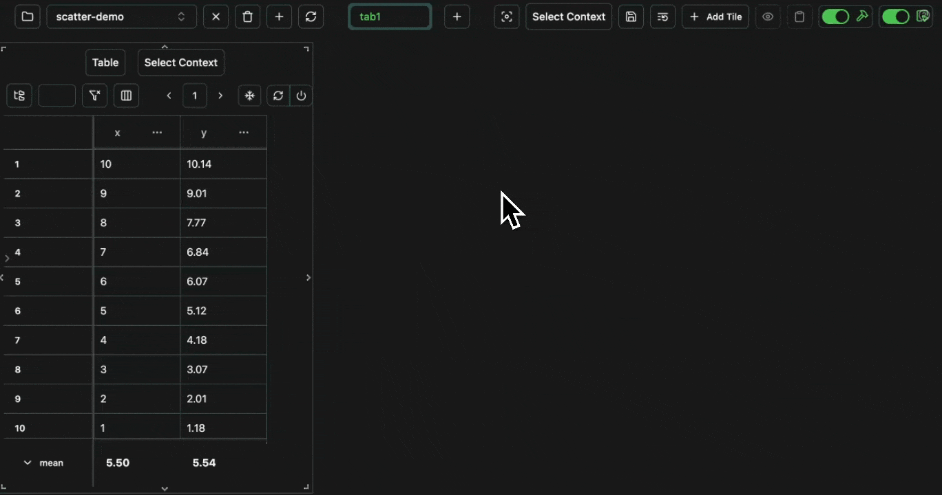
Scatter Graphs
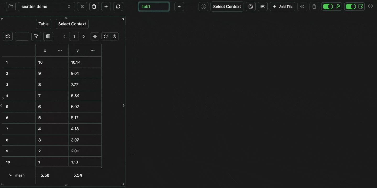
Scatter graphs can be used to plot two numerical columns against each other. For example, let’s log the following: Open in your consolex column for the x-axis and the y column for the y-axis.
Expand
Expand
 click image to maximize
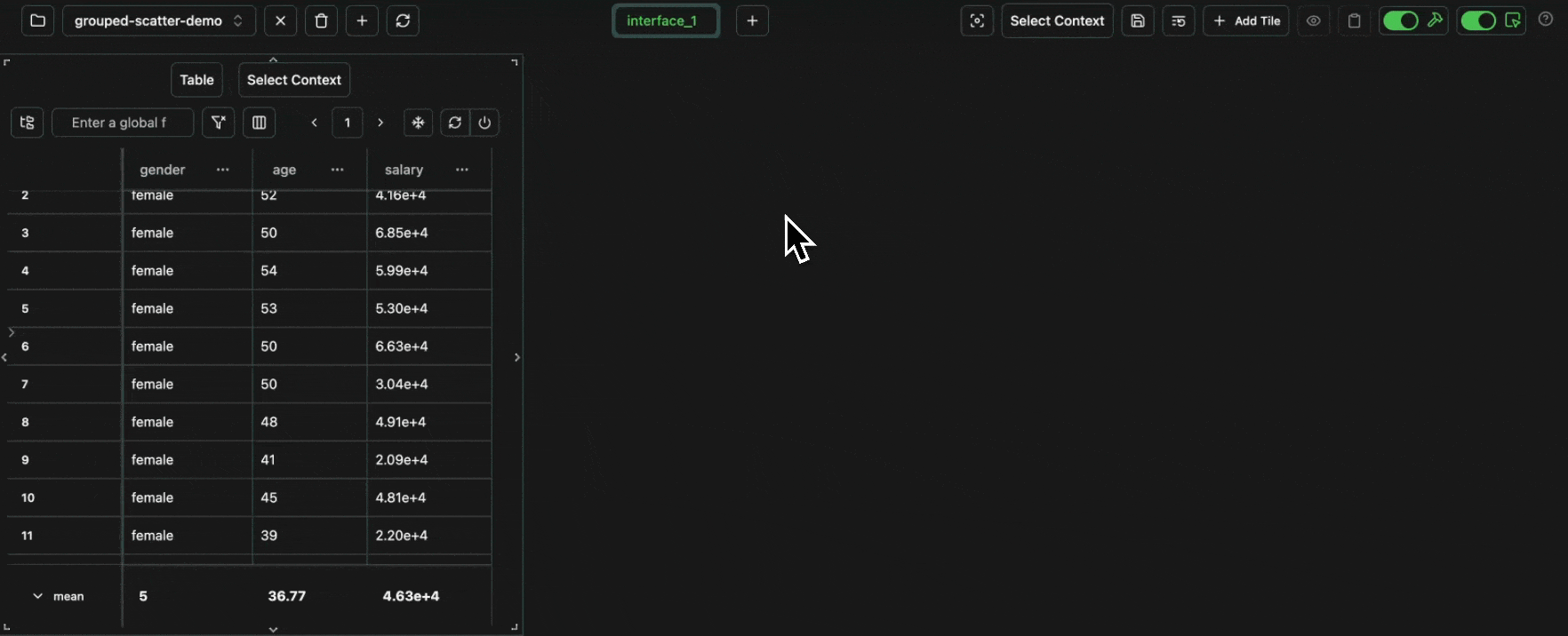
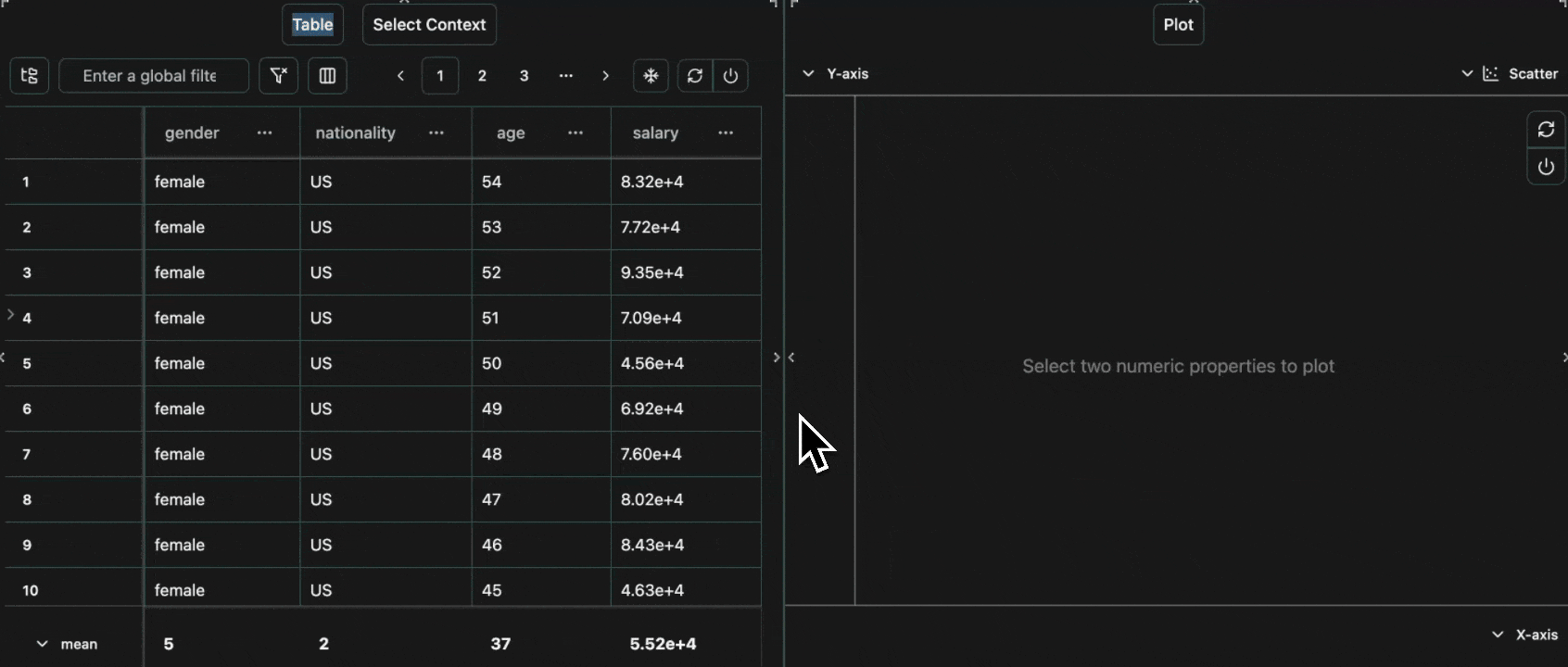
age for the x-axis, salary for the y-axis and group by gender.
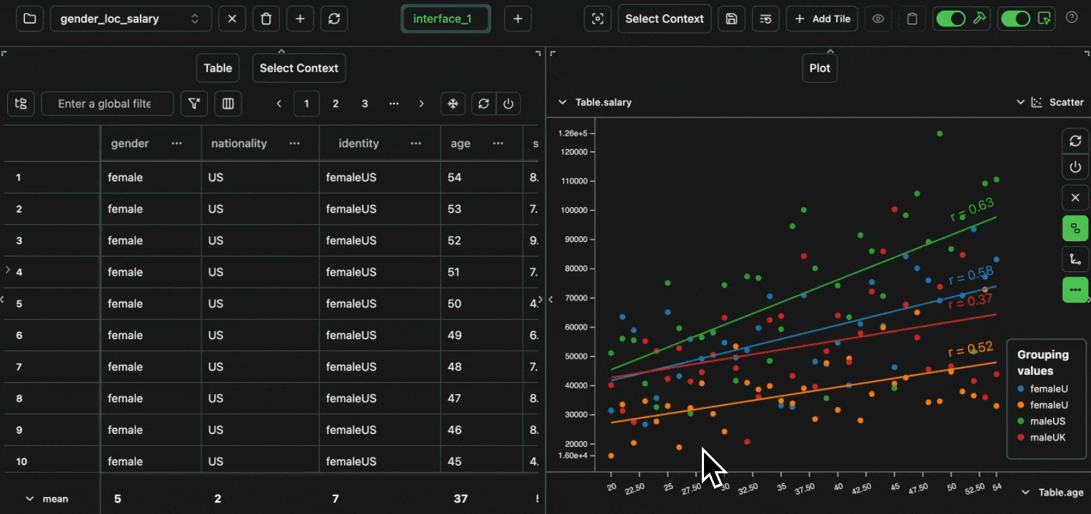
We can also add a line of best fit to each group in the plot.
Expand
Expand
 click image to maximize
gender + nationality with the equation gender + nationality.
We can then group by this new column.
Expand
Expand
 click image to maximize
gender, one which groups by location and one which groups by both.
We can then save this and revisit this dashboard again any time in future,
whenever more data is added into the project.
Expand
Expand
 click image to maximize
Line Graphs
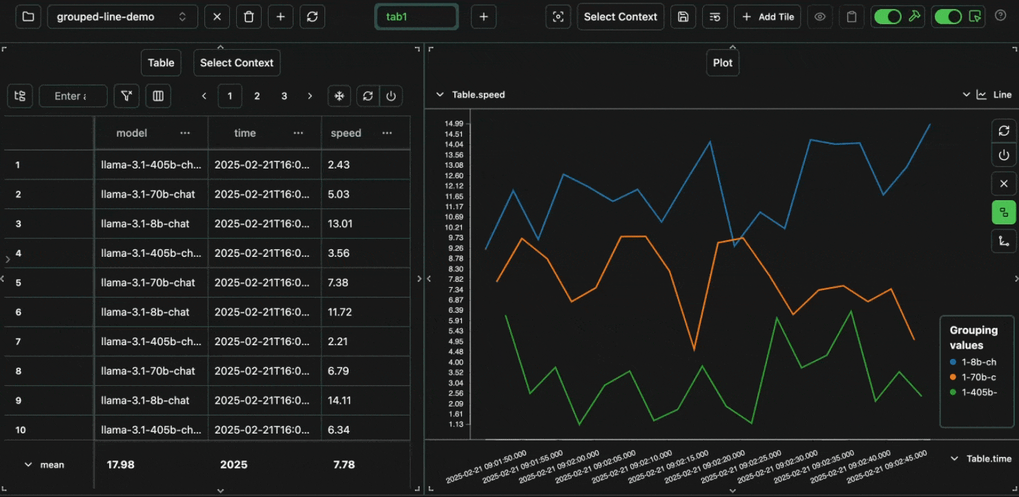
Line graphs are similar to scatter graphs, but a line is drawn between each from left to right. This makes them especially suitable for plotting time-series data. Let’s take the same example as before, but plot it as a line graph. Open in your consoleExpand
Expand
 click image to maximize
time for the x-axis, speed for the y-axis and group by model.
Expand
Expand
 click image to maximize
Expand
Expand
 click image to maximize
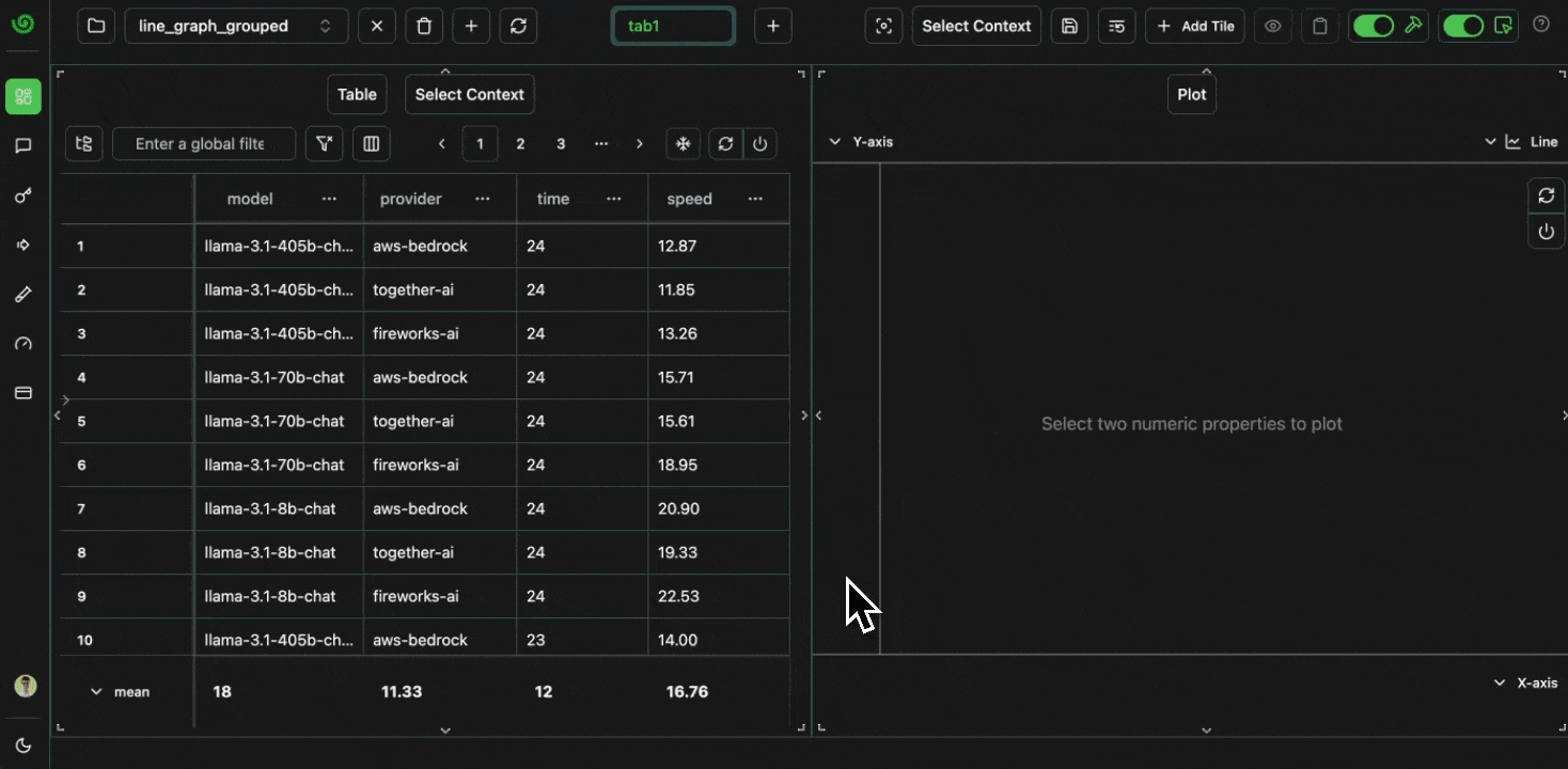
identity column before,
we can create a derived endpoint column to plot a unique line for each model + provider combination.
Let’s create some dummy data for this scenario:
Open in your console
Expand
Expand
 click image to maximize
Bar Charts
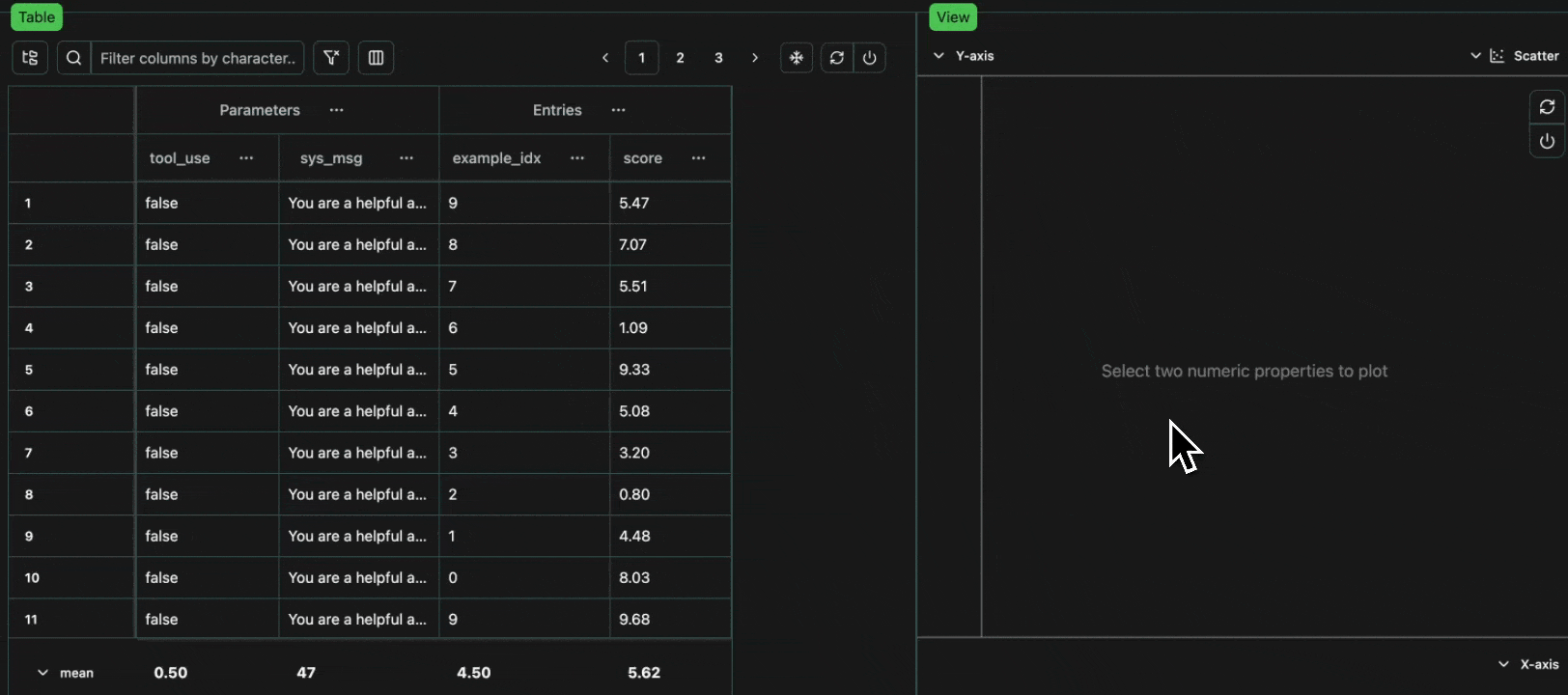
Bar charts are different to line graphs and scatter graphs. The x axis does not represent individual numerical values, but instead represents groups of data of any type (which share the same value). The y axis then represents a reduction across the data in each group (bar) in the graph. For example, let’s say we’ve run two experiments, which vary the tool use and the system message. Open in your consoleExpand
Expand
 click image to maximize
Histograms
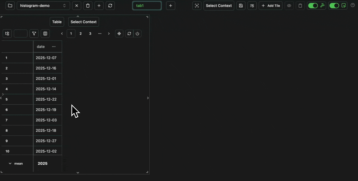
Finally, we can also plot histograms, which take a single numeric column, and then bucket this data inton bins on the x-axis, and plot the count of data in each bin on the y-axis.
For example, let’s say we want to see the distribution of user traffic over the past year.
Has our product been gaining traction?
Open in your console
Expand
Expand
 click image to maximize